In the fourteenth century, builders in present-day Windisch, Switzerland, uncovered remains of mosaic flooring and Roman coins: the first signs of the Roman legionary camp of Vindonissa. Ever since this first discovery, the land in Windisch has been yielding Roman treasures, slowly revealing the story of Vindonissa and the legionary soldiers who lived there.
One of the most important archaeological finds is the large collection of wooden tablets, bearing the remnants of letters written to and by the soldiers of the Roman legions at Vindonissa. These letters provide an intimate view of the lives of the residents of Vindonissa.
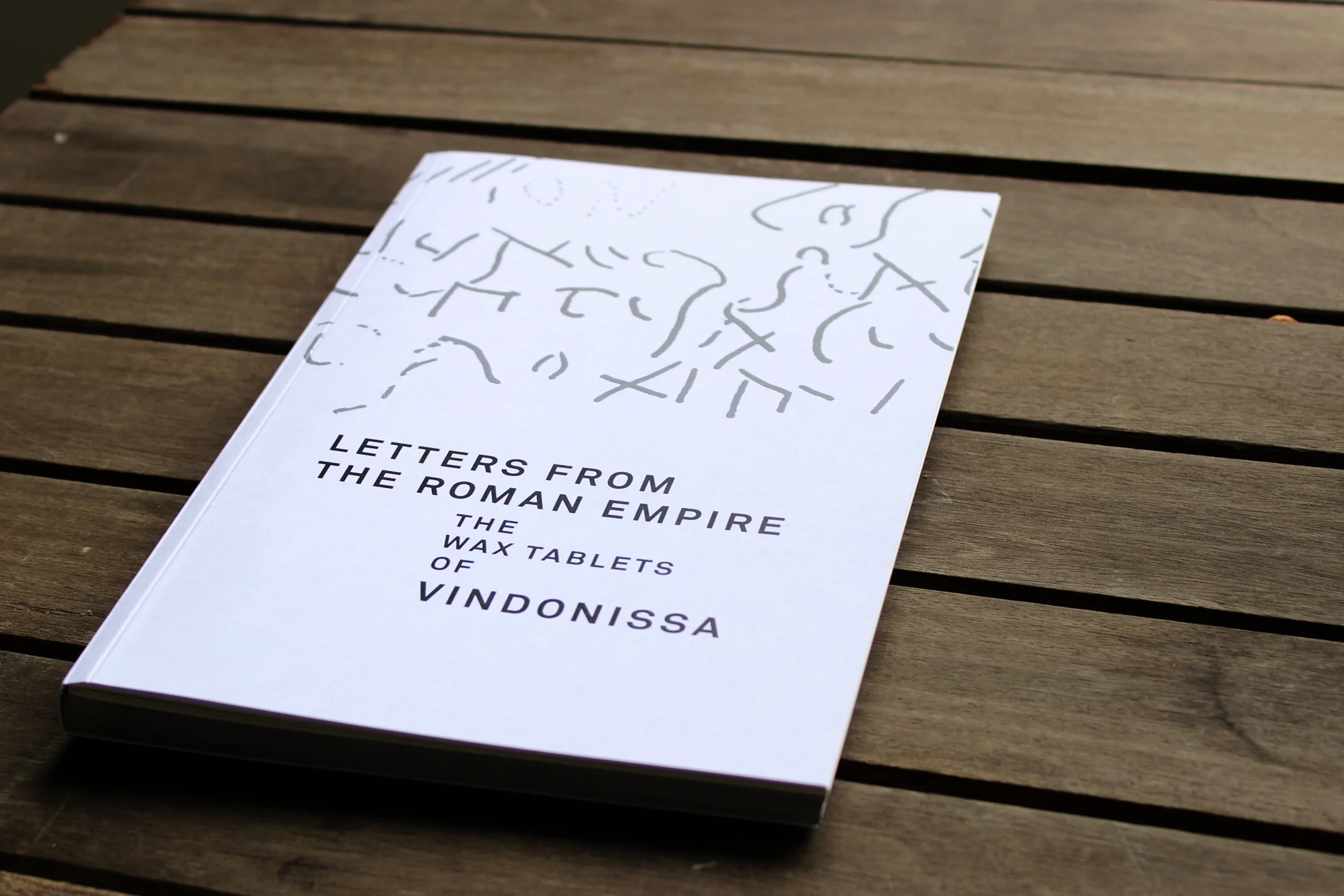
“Letters from the Roman Empire” provides information about Vindonissa, its function and its history, as well as a catalogue of the 70 legible letters found at the site, written in Latin with first-time English translations.
This project was a labour of love, since it combined my love of editorial design with my passion for history and archaeology. The content was created through in-depth research, with the help of the Gesellschaft Pro Vindonissa. The design reflects traditional archaeological catalogues through its clean, straightforward layout, with modernist touches.
I created “Illustrating Mindfulness” as part of my bachelor thesis work at the Zurich University of the Arts. My goal was to develop a visual language and set of teaching aids suitable for children, teachers, and parents.
The Illustrating Mindfulness package is an educational toolkit made up of learning aids that use visual language to introduce the concept of mindfulness to young children, as a way of equipping them with tools to deal with stress and process emotions. It consists of four parts: a picture book, an interactive workbook, a deck of activity cards, and an accompanying guide for adults.
In preparation, I carried out extensive research on the concept of mindfulness, as well as early childhood education and visual learning. Conducting interviews and surveys with children and teachers at a local pre-school helped me to develop a theory around visual language and learning, on which I based stylistic and content choices.
Since 2016 I have worked as in-house graphic designer for the company Coople. Based in Zurich and London, Coople provides a flexible work platform that connects hundreds of thousands of workers with enterprises across multiple sectors.
I have managed Coople’s developing brand through all the stages of its growth. I was part of a team implementing a full scale re-brand from Staff Finder to Coople in 2017. Since then I have been involved in, and led projects to update Coople’s design identity through several changes to brand and positioning. My role has included creating and updating brand guidelines, ensuring image consistency, running brand surveys, and creating brand and design strategies.
Alongside this strategic work, I have been responsible for producing visual assets required by Coople’s marketing teams in Switzerland and the UK. This has included visual content for social media, digital marketing, website, video, editorial and print advertising, sales and speaker presentations, as well as materials and stands for events and trade-fairs.
I was tasked with developing an illustrative style and producing illustrations and icons to be used across all marketing materials, and I also worked with Coople’s product designers to produce iconography and assets for in-app experience.
In 2013, I had the opportunity to participate in a competition to design the poster for the 2014 Langnau Jazz Festival. My work was selected as one of the three finalists.
I used jazz record sleeves to build a collage that contained relevant information about the festival. The collage also reflected the multidimensional atmosphere of a jazz festival, with its varied music, variety of bands, and colourful mix of people from all walks of life.
As part of a module on corporate branding at the ZHdK, I was tasked with creating the corporate identity and product packaging for Sara, a fictional cooperative for the production of traditional Tibetan medicine products. My goal was to develop a memorable identity for Sara based on the values and culture they represent.
A main concept of Tibetan medicine is that of the “five elements” that must be balanced for optimum health. Because of this, I developed a line of five different products each representing an element. Each product uses a mandala design that reflects the element and references the Buddhist use of mandalas as a tool for spiritual well-being.
From 2014 to 2023 I worked as in-house graphic designer for the Swiss ETH spin-off company Adaptricity AG (now Secure Switzerland AG). Adaptricity creates innovative software tools to power the transition from traditional electricity grid planning to smart grids of the future.
As one of the first employees of the brand-new start-up, I was responsible for developing and managing the brand identity. I created marketing assets for print and online campaigns, as well as materials for event and trade-fair presence. I was in charge of creating templates for presentations and other documents used for sales, PR, and speaker-events. I also managed the corporate website.
I was tasked with creating and maintaining a corporate design style-guide, and a style-guide and component library for the UX/UI design of software tools. During my time at Adaptricity, I completed several UX/UI design training programs and worked together with the software engineering team to optimise the architecture and design of the Adaptricity software products.
Before my departure I helped to begin the transition of Adaptricity into the pre-established style of new parent company Secure Meters.
A personal project over the course of a year, to fill a sketchbook with small black & white portraits of women - seen, or imagined.
Experiments in lino printing